In my last post, I made the case that the farm bill (which has now emerged from conference committee and just passed the House) makes an excellent teaching tool.
Many students, of course, are visual learners. So I thought I might suggest a few farm bill figures.
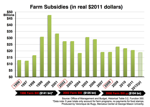
Let’s begin with farm subsidy outlays. These are the most conspicuous privileges afforded farmers. As Veronique de Rugy’s figure below shows, these were around $13 billion per year in the late ‘90s, then surged up to $28 billion in 2000, then settled into annual levels that were about twice their pre-surge levels after that (readers of Robert Higgs will recognize this as a “ratchet” pattern in government growth).
 (Click on any image in this post to enlarge it)
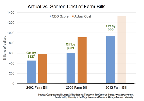
The last bar in Vero’s chart shows projected subsidies of about $29 billion in 2014. Another of Vero’s charts, however, suggests that this figure may be optimistic. The chart below shows projected and actual farm bill spending for the last couple farm bills (note: these figures include the entire bill not just subsidies, which is why the numbers are so much larger than those in the previous chart).
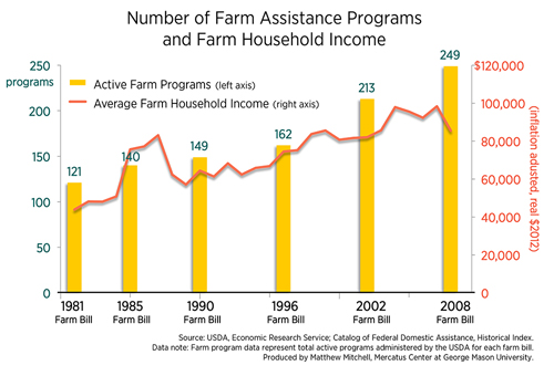
Though subsidies are the most conspicuous privilege afforded to farmers they are by no means the only or even the most important. In addition to cash outlays, farmers also benefit from an assortment of trade barriers (some of which have gotten us into trouble with the WTO), various marketing programs, and artificial price supports. My chart from last week shows how active farm assistance programs have grown over the years (along with farmer incomes):
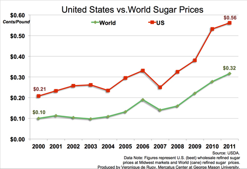
The chart below by Vero shows how one of these price support programs drives up the price of sugar:
As I write in my Mercatus on Policy piece:
This might seem trivial, but sugar isn’t the only item that is more expensive because of agricultural price supports. The House version of the farm bill imposes artificial price floors on wheat, corn, grain sorghum, barley, oats, long and medium grain rice, soybeans, oilseeds, peanuts, dry peas, lentils, chickpeas, sugar, and dairy products.
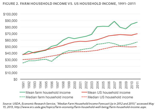
Farm privileges are often justified on the common assumption that farming is unprofitable. But this isn’t so. The figure below, taken from Vincent Smith’s paper on the 2013 bill, shows that both median and mean farm household income has exceeded median and mean US household income for more than a decade. Today, the average farm household makes 53 percent more than the average US household:
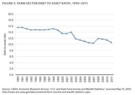
Farm supports are also often justified on the basis that farming is uniquely risky. As Smith explains, though, the business failure rate of the typical American business is 14 times greater than the failure rate of the typical farm. Moreover, as the figure below from his report demonstrates, the agriculture sector’s debt-to-asset ratio is lower than that of other sectors and has been falling for two decades:
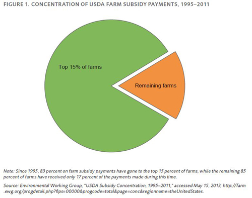
Though the average farm has done quite well, it is not the average farm that receives privileges. As demonstrated by Smith’s chart below, since 1995, 83 percent of subsidy payments have flowed to the largest 15 percent of farms:
As I put it in my piece, “Given that these subsidies and price supports distort free market signals and transfer wealth from the relatively poor to the relatively wealthy, one would think they would face bipartisan opposition.” Why, then, do they persist?
This chart by Vero, showing annual lobbying expenditures by the sugar industry is one explanation:

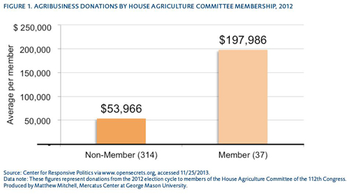
Finally, this chart from my piece shows that political donations tend to be concentrated on those who actually write the bill: